In today’s digital landscape, web design has become more than just aesthetics – it’s a strategic tool that plays a crucial role in capturing and retaining the attention of online audiences. With the ever-increasing competition in the online space, having a well-designed website has become a fundamental requirement for businesses to succeed online. A captivating website not only grabs the attention of visitors but also engages them, encourages them to explore further, and compels them to take action. Whether it’s to make a purchase, submit a form, or subscribe to a newsletter, the design of your website plays a pivotal role in influencing user behaviour and driving desired those actions.
In this guide, we will delve into each of these 10 key principles of web design in detail, providing insights and recommendations for creating websites that are visually appealing, user-friendly, and effective in achieving business objectives. Whether you are a business owner looking to revamp your website or a marketer seeking to optimise your online presence, these principles will serve as a guide to help you create captivating websites that stand out in today’s competitive digital landscape. Let’s dive in and explore the key principles of web design.
A consistent design throughout your website creates a cohesive and professional look. When visitors land on your website, they should immediately get a sense of your brand identity and aesthetics through consistent design elements. One key aspect of consistency is the colour scheme. Choose a colour palette that aligns with your brand identity and use it consistently across your website. This includes using the same or complementary colours for buttons, links, headings, and other design elements.
In addition to sticking to your branded colour palette, layout consistency is also critical. Use consistent spacing, alignment, and grid systems throughout your website. This helps create a sense of order and structure, making it easier for users to understand and navigate your website.
Consistency in design not only enhances the visual appeal of your website but also builds trust with your audience. A consistent design creates a professional and polished impression, indicating that you pay attention to detail and take your online presence seriously. It also helps users navigate your website more easily, making it a seamless and enjoyable experience.
2. Include Legible Fonts
The fonts you choose for your website should be easy to read and aligned with your overall design aesthetic. When identifying the right font for your website, consider factors such as legibility, compatibility, and brand consistency. Choose fonts that are easy to read, even at different font sizes, and are compatible with various devices and browsers. Avoid overly decorative or complex fonts that can be difficult to read on screens.
Once you’ve picked the perfect font, consider factors such as font size, spacing, and contrast. You need to include an appropriate font size that is easy to read on different devices, including mobile devices. Providing ample spacing between lines, paragraphs, and elements will enhance your website’s readability. Oh, and finally, ensure there is sufficient contrast between the text and the background to make the content stand out, you don’t want your content to get lost.
Legible typography enhances the overall user experience, communicates your brand identity, and helps convey your message effectively. Choosing the right fonts and using them consistently is a critical element of web design that should not be overlooked.
3. Provide Navigation That Makes Sense
Navigation is a fundamental element of web design that greatly impacts how users interact with your website. Intuitive and easy-to-use navigation is essential for helping users find the information they are looking for and navigate through your website seamlessly.
Your navigation menu should be prominently displayed and easily accessible, preferably at the top or in a sidebar, and should be consistent across all pages of your website. Use clear and descriptive labels for navigation links that accurately represent the content they lead to. We would suggest avoiding jargon or ambiguous terms that may confuse users. The navigation labels should align with the language and terminology that your target audience uses and understands.
Consider the placement and structure of your navigation menu. Keep it simple and uncluttered, with a limited number of main navigation links. If you have sub-pages or sub-sections, consider using dropdown menus or hierarchical structures to organise them logically. Remember, you don’t want to overwhelm your users with choices.
By incorporating clear and logical navigation, search functionality, breadcrumbs, and a well-structured layout, you create a website that is easy to navigate, enhances user experience, and helps users find the information they need efficiently.
4. Choose Your Images Carefully
Images play a vital role in web design as they can evoke emotions, convey messages, and enhance the overall visual appeal of your website. Choosing the right images for your website is essential to create a visually appealing and engaging user experience.
Choose images that are relevant to your content and convey the intended message. The images should align with your brand identity and the overall tone and style of your website. For example, if you have a website for a travel agency, images of beautiful destinations, people enjoying travel activities, and stunning landscapes would be relevant.
Always try to use high-quality images that are sharp, well-composed, and properly optimised for the web. Blurry or pixelated images can negatively impact the visual appeal and reputation of your website resulting in a poor user experience.
In addition to finding high-quality images that align with your brand, you’ll need to ensure that you include descriptive alt text for all images to ensure that users who rely on screen readers can understand the content of the images. You should also optimise your images for quick loading times to enhance the overall performance of your website.
Finally, you need to make sure that you have the proper rights and permissions to use the images on your website. Never use copyrighted images without permission, and make sure to credit the source of the images when required.
5. Establish A Visual Hierarchy
Visual hierarchy is the arrangement and presentation of elements on a webpage that guides users’ attention and helps them understand the importance and relationships between different elements. It involves various techniques such as placing important elements prominently, using contrast, alignment, grouping, consistency, and considering mobile responsiveness.
To establish a visual hierarchy in web design, it’s important to consider the importance of elements and make sure that the most important ones are prominently displayed using visual cues like size, colour, and placement. Contrast can be used effectively to differentiate between elements and draw attention to important ones. Proper alignment of elements creates a sense of order and coherence, and grouping related elements together visually helps users understand the relationships between them.
Consistency in the use of fonts, colours, and other visual elements throughout the website is crucial for establishing a cohesive visual hierarchy. This consistency helps users understand the organisation and structure of the website, making it easier for them to navigate and find information. Additionally, it’s important to consider mobile responsiveness and ensure that the visual hierarchy is optimised for smaller screens, making it easy to understand and interact with on mobile devices.
6. Use Whitespace
Whitespace, also known as negative space, is the empty space between different elements on a webpage. Whitespace provides breathing room for content and elements to stand out, creating a visually appealing and user-friendly website. Whitespace helps improve the readability, visual clarity, and overall aesthetics of a webpage by creating a clutter-free design, enhancing balance and proportion, and guiding the user’s eye towards important content or elements.
Whitespace creates a harmonious and visually pleasing layout, ensuring that elements are not crowded or competing for attention. Proper use of whitespace can also convey a sense of professionalism, elegance, and sophistication, aligning with the brand personality and message. Consider the strategic use of whitespace in mobile design as well, to ensure readability and usability on smaller screens.
7. Minimise Your Copy
When it comes to web design, less is often more. Long blocks of text or excessive copy can overwhelm visitors and lead to poor engagement. That’s why it’s important to minimise your copy and deliver concise, focused messaging that gets straight to the point. By simplifying your copy and using clear, concise language, you can create a website that is easy to understand, engaging, and effective in communicating your key messages.
One effective approach to minimising your copy is to use headlines and subheadings that convey the main ideas or key messages of your content. This allows visitors to quickly scan and grasp the main points without having to read through lengthy paragraphs. Use bullet points, numbered lists, and infographics to present information in a visually appealing and easy-to-digest manner. Avoid using jargon or technical terms that may confuse visitors, and instead use simple and relatable language that speaks directly to your target audience.
Remember, visitors typically have limited attention spans, so it’s important to capture their interest quickly and convey your messages efficiently. Well-crafted and minimalist copy can help you achieve that, making your website more effective in communicating your brand message and engaging your target audience.
8. Keep Your User at The Forefront
One of the most critical aspects of web design is putting the user at the forefront of your design decisions. A user-centred approach ensures that your website is designed with the needs, preferences, and behaviours of your target audience in mind. By understanding and empathising with your users, you can create a website that is intuitive, user-friendly, and provides a positive experience.
To keep your user at the forefront, it’s crucial to conduct thorough user research before starting your web design process. Understand who your target audience is, their demographics, preferences, and behaviours. Consider their goals, motivations, and pain points when designing your website. This will help you make informed decisions about the layout, navigation, content, and functionality of your site.
Another important aspect of keeping the user at the forefront is testing and optimisation. Regularly conduct usability testing to gather feedback from real users and identify any pain points or areas for improvement. Use this feedback to make necessary adjustments and iterate on your design to ensure an optimal user experience.
9. Use Hick’s Law
Hick’s Law, also known as Hick-Hyman Law, is a psychological principle that suggests that the time taken to make a decision increases with the number of choices or options presented. In the context of web design, Hick’s Law emphasises the importance of simplicity and minimalism in the design of your website.
When users visit a website, they are often looking for specific information or trying to complete a particular task. If they are presented with too many choices or options, it can lead to decision paralysis and a frustrating user experience. To avoid overwhelming your users, it’s essential to simplify your design and reduce the number of choices they need to make.
By applying Hick’s Law in your web design, you can create a user-friendly experience that simplifies decision-making for your users. Simplified navigation, clear content, and minimalistic design will help users quickly understand and interact with your website, leading to a positive user experience and increased engagement.
10. Continue to Optimise Your Website
Web design is not a one-time task but an ongoing process. Continuously optimising your website is crucial to keep it up-to-date, relevant, and effective in achieving its goals. Optimisation involves regularly reviewing and analysing your website’s performance, identifying areas for improvement, and implementing changes to enhance its performance and user experience.
One key aspect of website optimisation is monitoring and analysing website analytics. By using tools such as Google Analytics, you can gain insights into various metrics such as website traffic, user behaviour, conversions, and more. Reviewing these metrics will help you understand how your website is performing and identify any pain points or areas that need improvement.
Based on the data and insights from website analytics, you can make informed decisions on evolving your website. This may involve updating content, improving navigation, streamlining forms, enhancing page load speed, or making design adjustments. Continuously testing and iterating your website design based on user feedback and data-driven insights allows you to identify and resolve any issues, optimise user experience, and ensure that your website remains effective in achieving its goals.
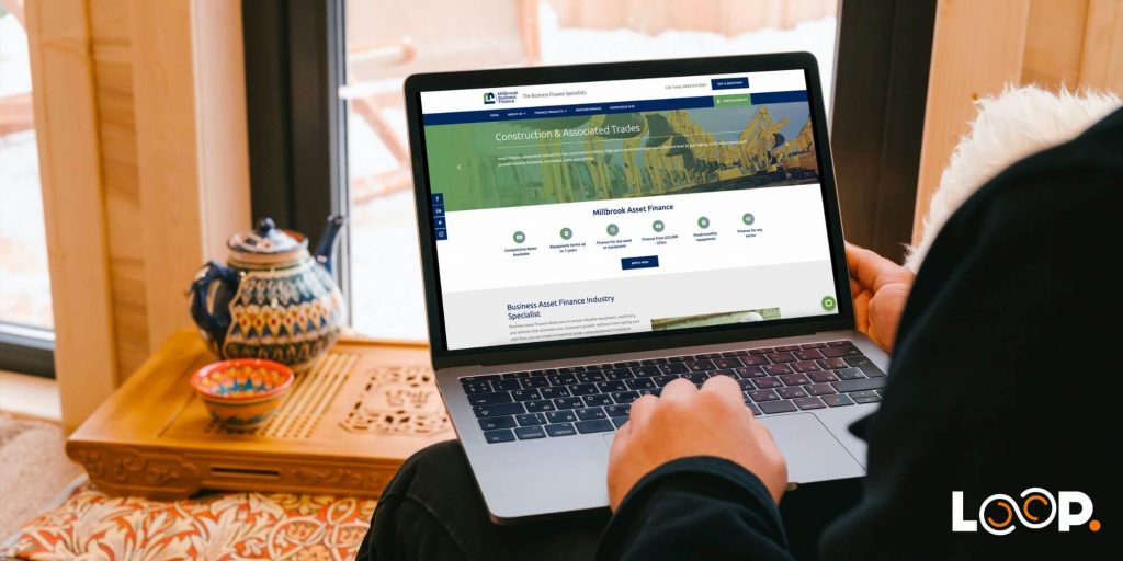
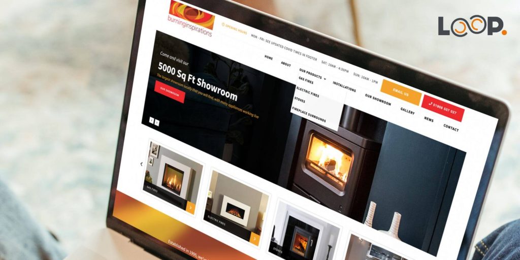
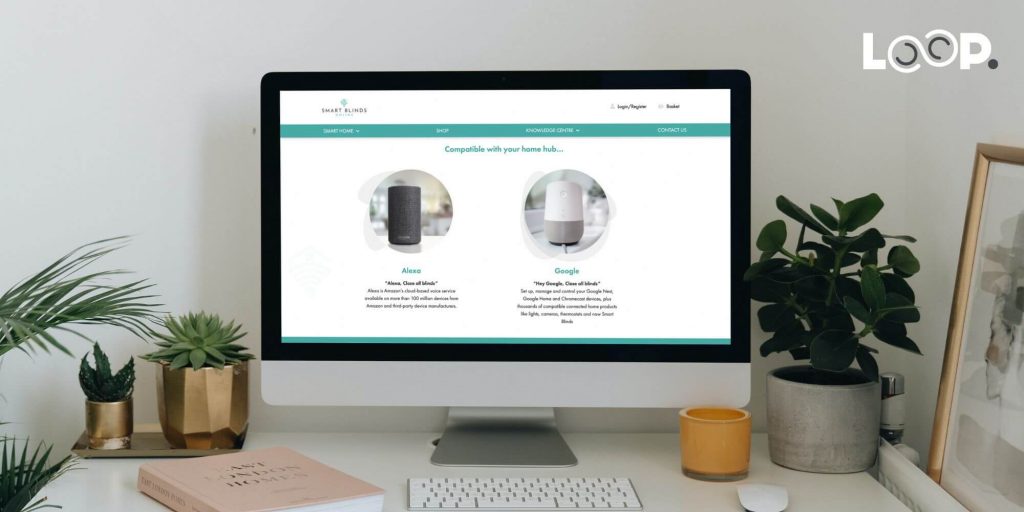
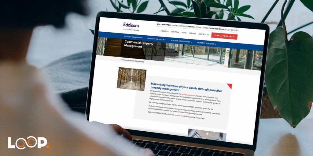
Web Design at Loop Digital
At Loop, we recognise the dynamic nature of web design and the evolving expectations of online users. We strive to create websites that not only meet the aesthetic demands of modern web design but also adhere to the key principles that contribute to a successful website. For more information about our web design services, please get in touch with a member of our team today.
Katie is our exceptional Lead Designer who possesses an innate passion for designing websites and creating captivating themes and aesthetics. Her unparalleled dedication to producing innovative solutions that address client needs and reshape user perceptions is truly commendable. Katie finds immense gratification in crafting tangible designs that leave a lasting impact. Equipped with a comprehensive university degree in Computer Management and Web-Based Studies, Katie brings a wealth of knowledge to the forefront of her role at Loop. Her educational background empowers her to leverage cutting-edge technologies and industry best practices to deliver exceptional design solutions. Katie's expertise shines through her ability to revamp websites, logos, and brands, allowing clients to showcase their business in a fresh and illuminating manner. Her keen eye for detail and creative flair breathe new life into digital assets, providing a platform for clients to shine in their respective industries. In addition to her professional pursuits, Katie's passion for baking serves as a testament to her creative nature and attention to detail. This dedication extends beyond her design work and fuels her ability to approach each project with meticulousness and care. Her ability to understand clients' unique requirements and translate them into captivating designs has garnered her praise and established her as a trusted design partner. Katie's professionalism and unwavering enthusiasm make her an invaluable asset to our team. Her expertise in website design, coupled with her dedication to delivering tangible results, sets her apart as a Lead Designer. Clients can expect nothing short of exceptional designs that elevate their brand, captivate their audience, and drive success.
Looking for your next opportunity?
Digital marketing careers
We’re always on the lookout for talented individuals to join our ever growing team. If you think you’d be a great match for Loop Digital, we’d love to hear from you.


