We are standing at a pivotal moment. The internet, once a series of static pages, is now a dynamic service layer where design is not just about looking good; it’s the engine of conversion, the gatekeeper of trust, and the defining element of your brand’s personality.
For too long, website design was treated as a cost centre or a final coat of paint. In 2026, design is unequivocally a core revenue driver. It is the most intricate part of customer attraction and sits firmly at the very top of the buyer funnel, instantly communicating value, credibility, and brand promise. The trends we see emerging now aren’t fleeting fads; they are structural shifts in how we interact with technology.
Research shows that over 90% of people’s first impressions of a brand come from its web design, and with mobile devices accounting for about 60% of web traffic, mobile-first, fast-loading sites are now table stakes. In short, a beautiful, usable website is no longer optional; it’s a core part of marketing and the sales funnel. Small tweaks in UX can yield big payoffs.
Top Web Design Trends to Watch in 2026
1. AI-Powered Personalisation: Every Visitor, a Unique Journey
If there is one reigning champion among the forthcoming web trends, it is the integration of Artificial Intelligence (AI) to create true, one-to-one hyper-personalisation. We’re moving beyond “Hello [Customer Name]” banners; we are talking about dynamic website structures that change content, layout, and even visual cues based on historical data, real-time behaviour, and predictive analytics.
Why is it working?
The primary reason customers love AI-driven UX is relevance. In a world saturated with digital noise, the ability to filter out the unnecessary and present exactly what the user needs at the moment they need it is invaluable.
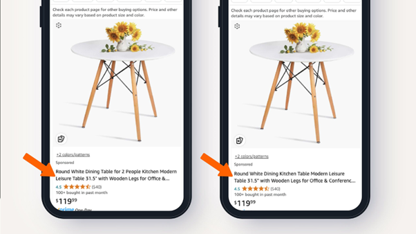
Instead of showing the same title to a large group of people, the title is being edited for you. For example, if you just searched for “low-sugar protein bars”, the LLM might change a generic title from “Delicious Chocolate Protein Bar” to “High Protein, Low Sugar Chocolate Bar”.
AI (LLMs) deeply analyses customer behaviour and product details. One AI edits the product title to highlight features most relevant to the shopper; a second AI checks and refines this title for superior personalisation.
Reduced Cognitive Load: The site intuitively knows what you are looking for (e.g., hiding a beginner’s guide if you are a returning expert user).
Instant Gratification: Recommendations are spot-on, speeding up the path to purchase.
Feeling Understood: Personalisation fosters a sense of relationship and loyalty between the user and the brand.
This design trend allows marketers to ensure that high-value segments are shown high-value content immediately, shortening the time spent in the consideration stage of the funnel.
2. Resonant Stark (Emotional Minimalism)
After years of visual overload, clarity and simplicity are staging a comeback, but with heart. The Resonant Stark trend strips pages to their essentials while adding subtle emotional cues. Resonant Stark “thrives on simplicity as a storytelling tool”, using neutral gradients and purposeful animation to “guide the eye and emphasise meaning”.
In layman’s terms, it is commonly termed as Scrollytelling, a design technique where scrolling actions trigger layered animations, data visualisation reveals, 3D model rotations, or video segments.
Why is it working?
It reads as both professional and human. In a cluttered digital world, a simple layout tells users “focus on what matters here,” which is ideal for healthcare, fintech or innovation brands. The style signals honesty and modernity. Conversion-wise, less clutter means faster load times and fewer distractions on calls to action.
Who is doing it?
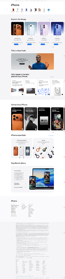
Apple’s website: notice how its product pages now often feature calm layouts, large whitespace and minimal text. Users know this signals premium quality, and it delivers results in brand perception and purchases.
Reduced Cognitive Load: Clean design reduces the cognitive load on the user by an estimated 40%, leading to faster decision-making and a clearer path to purchase.
Reduced Friction/Cart Abandonment: Cluttered, confusing, or slow pages are a major cause of cart abandonment. An optimised, minimalist aesthetic significantly reduces the chance that an online shopper will abandon their cart, which occurs in 1 in 3 cases on cluttered sites
3. Visual Tactility: The Rise of Frosted Touch and Subtle Skeuomorphism
While AI handles the data and scroll-telling handles the narrative, the third major web design trend concerns the sheer feel of the interface. Since we can’t physically touch the screen texture, designers are using visual cues to replicate a sense of depth, softness, and real-world interaction, a concept known as Visual Tactility.
This trend manifests in two key styles:
Frosted Touch (Glassmorphism): This style uses translucent, blurred backgrounds (like frosted glass) with soft shadows and thin borders. It creates depth, allowing background layers to subtly peek through, making elements feel physically layered on the screen. It’s sleek, futuristic, and promotes a clean yet layered look.
Light Skeuomorphism: A return to realism, but highly refined. Think gentle 3D shadows, soft gradients that mimic natural light hitting a surface, and embossed buttons that look gently clickable. It’s not the heavy 3D icons of 2010; it’s ultra-subtle realism designed to encourage interaction and reduce the sterile feel of flat design.
Why is it working?
Users enjoy Frosted Touch because it feels modern without being cold. The subtle transparency suggests layers of content but still keeps focus; the blurred panels naturally draw attention to foreground text or buttons. It also echoes popular UI trends from mobile and desktop, making websites feel cutting-edge. It can improve perceived performance by making loading elements appear layered.
Who is doing it?
The “Acrylic” effect is a key material component within Microsoft’s Fluent Design System, introduced to modernise and unify the user experience across Windows and related applications, prominently featured in Windows 11. Acrylic is a distinctive, semi-transparent, blurred material, often described as “frosted glass”, used primarily to create depth and visual hierarchy.
By revealing the underlying desktop or window content (Background Acrylic), it adds visual context and warmth, making the interface feel more personal. While the use of Acrylic was refined in Windows 11, reserved mostly for fleeting elements like right-click menus and flyouts, its core aesthetic principle of using translucency and blurring to simulate real-world glass surfaces directly aligns with the broader UI trend known as Glassmorphism.
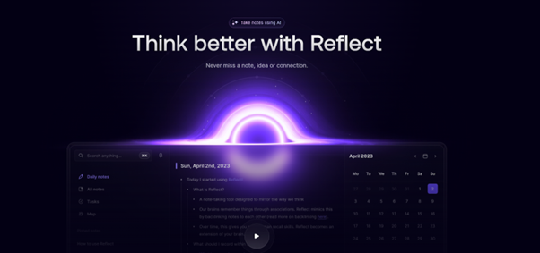
Reflect.app (A notepad app) is often cited as a clean example of this modern aesthetic. Design generators like the one on Hype 4 Academy demonstrate the effect and provide the CSS code to implement it.
The results and impact of the Fluent Design System are measured using metrics focused on three main areas:
Performance Metrics: Tracking load times and power consumption, which led to the optimised use of Acrylic (only for transient surfaces) and the introduction of the less resource-intensive Mica material for main window backgrounds.
Engagement and Adoption: Monitoring the frequency of use and the rate at which users adopt new Windows 11 features that utilise the cohesive Fluent visual language.
Consistency and Efficiency: Internally, measuring developer efficiency and product consistency, as the unified design system reduces visual complexity and development time across the Microsoft ecosystem.
4. Dial-Up Delight and Cute-alism (Retro and Playful Aesthetics)
On the other end of the spectrum, a strong wave of nostalgia and playful designs is reviving old-school web styles for new audiences. Two intertwined trends exemplify this:
Dial-Up Delight (Y2K Revival): Bright, cluttered, cyber-goth: think late-’90s MySpace meets Y2K. This trend uses gothic or pixelated fonts, candy-bright gradients, glittery textures and intentional chaos. Layouts may feel “broken” on purpose with overlapping text, akin to hacking a digital scrapbook. Gen Z in particular loves this nostalgia for the Web’s DIY era. The effect is an edgy, attitude-driven site that pops out of the feed.
Cute-alism: On the flip side, cute-alism blends kawaii (Japanese for “cute”) graphics with brutalist structure. Imagine a rigid boxy grid and the Courier monospace font (brutalism) splashed with neon pink hearts, smiley stickers and round buttons. The clash of raw and playful makes sites feel fun and irreverent. Marketers describe it as equal parts “raw HTML and bubblegum pop”
Why is it working?
These trends succeed simply because they grab attention. Users are fatigued by uniform, corporate sites, so a candy-coloured, kawaii-inspired page or a gritty Y2K layout feels fresh and delightful. It’s “Instagram meets sticker album” on the web. Brands aiming at young audiences (fashion, music, indie food/shopping) often leverage these looks.
Who is doing it?
While it’s harder to attach hard ROI to a style like Cute-alism, the principle holds that memorable design drives social sharing and brand buzz. (Think of how quickly a bold “In My Feelings”-era Drake music video had its visuals mimicked; web pages can have similar viral pull.)
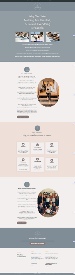
In a world of endless notifications, some brands are going the opposite direction: cosy and simple. Dubbed Snug Simple, this trend makes interfaces feel like a comforting space. Think soft neutral backgrounds (beige, warm grey), chunky rounded fonts, pastel accent blocks and friendly icons.
It’s a bit like an app that feels hand-crafted or a local cafe’s decor translated to pixels. The idea is to make your site feel reassuring and easy to navigate.
Snug Simple is especially popular in wellness, community and lifestyle niches. For instance, a yoga studio’s website might use muted purple tones and a rounded sans-serif to feel peaceful. A local coffee shop’s site could employ chunky type and warm, creamy colours so visitors feel “at home” before even entering the store.
In practice, this often means single-column layouts, generous whitespace and no sharp corners, a relaxing digital living room, essentially. Conversion impact comes from trust and reduced friction: people slow down and explore more when they feel at ease. Commonly, these designs are adopted by lifestyle websites or Yoga Centres.
Subtle motion is moving from “nice-to-have” to a design necessity. Micro-interactions – think button hover effects, smooth transitions, or a tiny animation when you like a post – guide users through the site and make it feel alive.
Research notes that Google’s latest Core Web Vitals include a metric called Interaction to Next Paint, underlining how critical it is that these animations are fast and responsive. Well-executed motion can highlight calls to action and reassure users (“yes, I clicked that!”) without distracting.
Examples: a menu item might gently underline as you hover (giving immediate visual feedback), or icons might bounce slightly when hovered. Even loading states can be playful mini-animations instead of static spinners.
While it’s hard to quantify (companies rarely publish “animation adoption rates”), surveys consistently show people find interactive sites more engaging. Simply put, movement (used sparingly) keeps users interested and can lift key metrics: one estimate is that, on average, good motion design can improve conversion by up to 10–15% by directing attention where it’s needed.
Ethical, Accessible and Inclusive Design
Finally, expect values-driven design to surge. Users today judge brands by ethics and inclusivity, and they want sites that reflect that. Accessible and sustainable design is transitioning from an afterthought to mainstream. For example, 92% of consumers now say they trust brands that are eco-friendly or socially responsible, and 65% consider privacy and inclusivity vital.
Websites are following suit: we’ll see more universal design (WCAG-compliant layouts, high contrast and optional dark modes) and sustainable practices (lean code, green hosting badges and dark-mode colour schemes to save energy).
Dark mode itself remains trendy; it’s easier on the eyes in low light and aligns with minimal, contrasting colour schemes. Brands like Apple and Tesla offer dark-mode toggles on their sites, and studies show a high portion of users now prefer it.
More broadly, companies will highlight their values on websites: transparent data policies, quiet animations (so they’re comfortable for all users), alt text for images, keyboard navigation and AI chatbots that are respectful of privacy.
While this is partly driven by law (laws like the European Accessibility Act), it also boosts engagement: a site everyone can use and that feels “human-first” naturally attracts a wider audience. In one survey, nearly half of users said they’ll completely abandon a site with bad accessibility.
Making the Trends Work for Your Business
Business Intent / Message
Appropriate Design Trend(s)
Example Industry Fit
Rationale
Cutting-Edge/Modern
Frosted Touch or Skeuomorph cues
Avant-garde Game Developer, Tech Startups
Uses advanced visuals (transparency, blurring, 3D realism) to signal innovation and modernity.
Trust and Simplicity
Resonant Stark with a Snug Simple vibe
Law Firm, Financial Services, Healthcare
Emphasises clarity, straightforwardness, and professional reliability through minimal and clean design.
Nostalgia / Youth Appeal
Dial-Up Delight or Cute-alism
Retro Clothing Brand, Fun Consumer Goods, Media aimed at Gen Z
Leverages past design elements (early internet look) or charming aesthetics to engage a specific, younger demographic.
Avant-Garde/Edgy
Neon Brutalism
High-Fashion Streetwear, Indie Music Labels
Bold, harsh, and experimental aesthetics are used to stand out and signal unconventional creativity.
The Era of the Digital Concierge
The evolution of web design trends leading into 2026 marks a decisive shift from transactional platforms to truly personalised, immersive brand experiences. We are moving past the age of the flat, generic brochure site and embracing the age of the Digital Concierge.
The convergence of AI personalisation, sophisticated scroll-triggered narratives, and foundational performance metrics is reshaping the marketing landscape. By adopting these trends, you are not just updating your website; you are investing in a hyper-efficient, highly converting digital asset that attracts, delights, and guides customers from first glance to final sale. Don’t fall behind. The time to implement the future of web design is right now.
Why Design Trends Matter for Marketing
Web design isn’t just art for art’s sake; it drives business results. A site that aligns with current trends looks fresh and can boost engagement. Importantly, design choices impact every stage of the buyer funnel. Imagine a prospect visiting your homepage: does the layout lead them gently to key product or signup pages? Does the style match your brand’s promise? Good design builds credibility and keeps people browsing. The buyer funnel used to start with awareness built by advertising, leading customers to a generic website landing page. Today? Customers are searching for solutions, and your website is often the very first touchpoint, determining awareness, consideration, and conversion simultaneously.
This is where the shift becomes critical. A high-ranking website needs to demonstrate immediate value. Speed, accessibility, and relevance must be baked into the design from the ground up. If a site loads slowly, is difficult to navigate on a mobile phone, or presents irrelevant information, the user bounces. That is not just a missed click; it’s a lost opportunity and a negative brand impression that damages downstream marketing efforts.
Consistent updates, say, embracing mobile-first layouts or accessible design, can boost your SEO and help meet user expectations. Google’s Core Web Vitals now rank page speed and interactivity as SEO factors, and companies that “go trend-savvy” often edge out competitors.
The best web design trends for 2026 are focused entirely on reducing friction and enhancing psychological connection. They turn a browser into a concierge, making every visitor feel seen, guided, and valued. This is how sophisticated design fuels the buyer funnel:
Awareness: Instant visual appeal, a clear value proposition, and site performance ensure the visitor stays long enough to register your brand.
Conversion: Hyper-personalisation and clear Calls-to-Action (CTAs) remove the guesswork, leading directly to sales, sign-ups, or leads.
In 2026, if your website isn’t actively working to convert, it’s actively working against you.
Ready to Future-Proof Your Funnel?
Stop chasing fleeting fads and start building a digital asset that genuinely converts. Here at Loop Digital, we don’t just follow the web design trends for 2026; we translate them into measurable success for your brand. We understand the power of AI personalisation, the engagement magic of scroll storytelling, and the foundational necessity of speed and accessibility.
A. Aside from the themes above, other key trends include mobile-first responsiveness (a must, since a majority of users are on phones), performance optimisation (fast sites win conversions), and storytelling layouts (using sequential sections or interactive elements to guide users). Immersive visuals like 3D graphics can add “wow” to product pages, as long as they don’t slow the site. The overall move is toward “websites that understand their users”, via AI or smart design, and content that feels more like an experience than a list of info.
2. How do these design trends improve marketing results?
A. By driving engagement and conversions. Trends such as personalisation and micro-interactions make each visitor feel seen and clear about what to do next, nudging them down the funnel. Minimal, trust-building designs (Resonant Stark) reduce cognitive load so visitors don’t bounce. Nostalgic or playful designs (Dial-Up Delight, Cute-alism) can boost brand affinity and social sharing, especially with younger demographics. Ethically minded trends (accessible and eco-friendly design) resonate with values-driven buyers and can foster loyalty.
3. Which companies exemplify these trends?
A. Big and small brands are already paving the way. Amazon.com is the poster child for AI-personalisation. Luxury retailers and startups are using clean “Resonant Stark” layouts to signal premium quality. Banks and tech apps (like Venmo and Notion) often use Frosted Touch for a modern look. Duolingo.com and other edtech sites showcase conversational UIs and gamified, playful layouts for engagement. On the playful side, fashion and media sites like Wix.com’s blog (and many indie e-shops) have adopted cute-alism or maximalist graphics to stand out. Even B2B brands leverage trends: industrial companies are adding soft pastel accent blocks (snug simple) to humanise their technical content. Wherever the data is public, these redesigns correlate with positive outcomes – increased time on site, lower bounce, and yes, more conversions.
4. How should I incorporate trends into my website?
A. Start by auditing your current site: mobile usability, load speed, accessibility compliance, and branding consistency. Then pick 1–2 trends that align with your audience and brand voice. For example, a local café might revamp with Snug Simple pastels and hand-drawn icons (cosy feel), while an up-and-coming tech SaaS might refresh with lighter skeuomorphism and subtle animations (modern feel). Use trusted design tools or builders that support these features: many CMS platforms now have built-in glass effects, AI layout tools, or accessibility checkers. Crucially, test changes with real users. Small A/B tests can show whether a new hero animation or colour palette actually increases signups or time on page.
5. Will these trends change quickly?
A. Some trends (like Y2K nostalgia) are cyclical, while others (AI personalisation, mobile-first design) are likely long-term. The good news is that many 2026 trends, such as minimalism, personalised UX, and ethical design, are grounded in core user preferences (ease, relevance, and trust). These will remain important beyond 2026. So even if next year brings something new, keeping your site user-centred and adaptive will keep you ready. In practice, this means building a flexible design system and monitoring analytics. That way, when 2027 trends arrive, you can pivot without rebuilding from scratch.
Katie is our exceptional Lead Designer who possesses an innate passion for designing websites and creating captivating themes and aesthetics. Her unparalleled dedication to producing innovative solutions that address client needs and reshape user perceptions is truly commendable. Katie finds immense gratification in crafting tangible designs that leave a lasting impact. Equipped with a comprehensive university degree in Computer Management and Web-Based Studies, Katie brings a wealth of knowledge to the forefront of her role at Loop. Her educational background empowers her to leverage cutting-edge technologies and industry best practices to deliver exceptional design solutions. Katie's expertise shines through her ability to revamp websites, logos, and brands, allowing clients to showcase their business in a fresh and illuminating manner. Her keen eye for detail and creative flair breathe new life into digital assets, providing a platform for clients to shine in their respective industries. In addition to her professional pursuits, Katie's passion for baking serves as a testament to her creative nature and attention to detail. This dedication extends beyond her design work and fuels her ability to approach each project with meticulousness and care. Her ability to understand clients' unique requirements and translate them into captivating designs has garnered her praise and established her as a trusted design partner. Katie's professionalism and unwavering enthusiasm make her an invaluable asset to our team. Her expertise in website design, coupled with her dedication to delivering tangible results, sets her apart as a Lead Designer. Clients can expect nothing short of exceptional designs that elevate their brand, captivate their audience, and drive success.
Looking for your next opportunity?
Digital marketing careers
We’re always on the lookout for talented individuals to join our ever growing team. If you think you’d be a great match for Loop Digital, we’d love to hear from you.