There are a lot of websites out there that look good at first glance. Clean layouts, nice colours, trendy fonts. But great website design goes deeper than that; it’s about how a site works for the people using it and the business behind it.
This post exists for that exact reason. Not as a sales pitch, and not as a list of design trends to follow, but as a closer look at website designs that genuinely do their job well. These are websites built for Northampton and Northampton-focused businesses, designed with real goals in mind: to be found, to be understood, and to turn visitors into customers.
What follows is a behind-the-scenes look at a selection of favourite website designs in Northampton. Not just what they look like on the surface, but why they work, what they were designed to achieve, and what makes them effective for the businesses they represent.
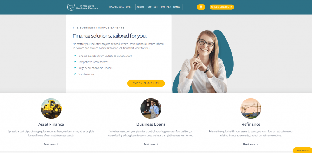
Case Study 1: White Dove – From One Page to a Website That Can Actually Grow
Originally, the website was built as a single-page site. While one-page websites can work well for very simple offerings, they often become limiting as a business grows, especially in a competitive sector like finance. Important information ends up squeezed together, services aren’t clearly defined, and search engines have very little context to understand what the business actually offers.
The Challenge
Originally, White Dove used a one-page layout. While simple, it created several roadblocks:
Information Overload: Important details were squeezed together, making it hard for users to focus.
Poor SEO: Search engines lacked the context needed to rank the site for specific financial services.
Limited Trust: In the competitive finance sector, a lack of detailed service pages can hinder credibility.
The Solution
The site was rebuilt as a comprehensive, multi-page platform designed for clarity and expansion.
Dedicated Service Pages: Each finance solution now has its own space, allowing for in-depth explanations and better search engine visibility. A professional, multi-page layout provides the transparency and reassurance required in financial services.
Interactive Tools: We integrated a financial calculator and an eligibility checker to engage users immediately. Features like the eligibility checker allow users to take the first step in the decision-making process without needing to pick up the phone.
Structured UX: Clearer user journeys were mapped out to guide visitors from initial interest to a final inquiry. The new structure isn’t “launch and leave”; it is a flexible foundation that can grow as White Dove adds new services or marketing campaigns.
The website has just launched, which makes this project an especially exciting one to watch. With stronger foundations in place, clearer service messaging, and improved conversion opportunities, White Dove is now positioned to get far more value from its online presence, and this is only the beginning.
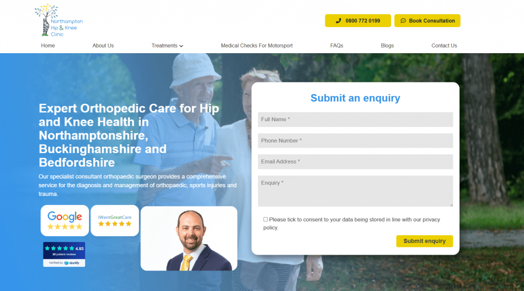
Case Study 2: Northampton Hip & Knee Clinic – Designing With Conversions in Mind
When it comes to healthcare websites, design has a very specific job to do. People aren’t browsing casually; they’re often looking for reassurance, clarity, and clear guidance on what to do next. That’s exactly where the Northampton Hip & Knee Clinic website really shines.
The Challenges
High-Friction Enquiries: Previous iterations made it difficult for users to find contact methods, causing potential patients to drop off when they were ready to take action.
Navigation Clutter: Organising complex medical treatments without overwhelming the user is a common hurdle in healthcare web design.
Niche Service Visibility: Specialist services, such as “Medical Checks for Motorsport”, were often buried, making it hard for specific target audiences to find them.
The Solutions
Streamlined Enquiry Forms: We implemented clear, accessible forms that appear at natural decision points, allowing users to reach out the moment they feel ready. By removing the “search” for contact details, the site drastically reduces the barrier to booking a consultation.
Simplified Treatment Layouts: Navigation was redesigned to be clean and logical, categorising treatments so users can find specific information in seconds. The professional, clutter-free design mirrors the calm environment patients expect from a specialist clinic.
High-Visibility Specialist Links: “Medical Checks for Motorsport” was given a permanent, visible spot in the main navigation to highlight the clinic’s unique expertise. Direct navigation for niche services (like Motorsport medicals) ensures the right patients feel they are in the hands of an expert.
Minimalist, “Calm” Design: Used a clean interface with subtle colour contrasts to highlight important actions without using aggressive or “flashy” sales tactics. A logical flow of information helps patients move from initial curiosity to the confidence needed to book an appointment.
This balance is exactly why the site stands out. It feels trustworthy and professional while still being approachable and easy to use. Every design decision supports the user journey, helping people move from curiosity to confidence. It doesn’t just look polished, it works hard behind the scenes, supporting enquiries and making the website a genuinely valuable tool for the clinic.
Website and conversions sound like a tricky topic? Check this out:
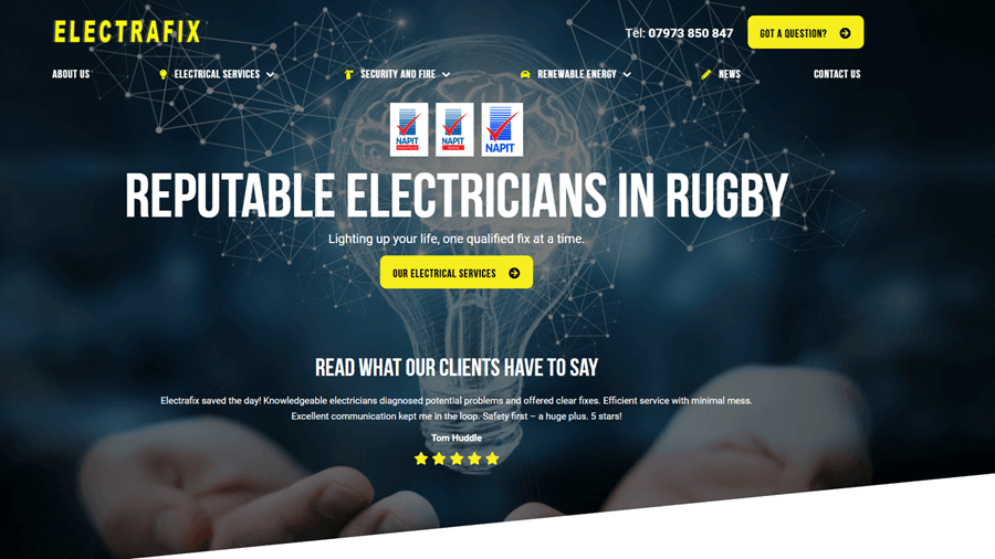
Case Study 3: Electrafix – Proving Location Pages Done Properly Can Work
Electrafix is a brilliant example of how local targeting doesn’t have to be limited by a business address. This is especially a tactical move in the home improvement sector. Although the company is based in Daventry, the website has been carefully structured to support growth in Northampton through a dedicated, well-thought-out landing page strategy, and it works because it focuses on relevance, not just postcodes.
The Challenges
Geographic Limitations: Based in Daventry, the business struggled to gain visibility and trust from customers in the larger, nearby market of Northampton.
Service Overlap: Offering electrical, security, and renewable energy services can easily become confusing if not categorised correctly, leading to high bounce rates.
Brand Dilution: Trying to target multiple locations on a single homepage often confuses search engines and dilutes the local relevance for the user.
The Solutions
Dedicated Location Landing Pages: Created a high-performing Northampton-specific landing page that speaks directly to that local audience without affecting the core brand identity.
Siloed Service Sections: Developed distinct, dedicated areas for Electrical, Security/Fire, and Renewable Energy, making it immediately clear what problems the business solves.
High-Contrast Professional Design: Used a dark background with light, contrasting content blocks to make service descriptions and calls-to-action (CTAs) highly visible.
Non-Linear Navigation: Built internal links between related services, allowing users to explore the site naturally without hitting “dead ends”.
What makes this project particularly effective is how intentional everything feels. The website supports growth into Northampton, strengthens trust through clear service messaging, and provides a solid foundation for future expansion, all without overwhelming users. It’s a great example of how smart location targeting, paired with thoughtful design, can help local businesses grow in a focused and sustainable way.
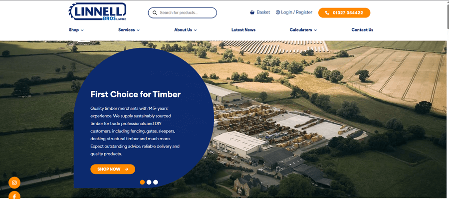
Case Study 4: Linnell Bros – A Design We Just Genuinely Love
Some websites earn a place on this list not because of a single clever feature, but because everything comes together beautifully. Linnell Bros is one of those projects. It’s visually strong, easy to use, and confidently different from the more service-led websites, making it a really enjoyable one to work on and to explore.
The Challenges
Complex Buying Decisions: In the timber and decking industry, customers often struggle to calculate exactly how much material they need, leading to abandoned carts or incorrect orders.
Transactional Friction: Most eCommerce sites force a “Buy Now” path, which can alienate customers who are in the research phase or have complex, large-scale requirements.
Dated Brand Perception: The business needed a way to showcase its heritage and craft while appearing modern and professional enough to compete in a digital-first market.
The Solutions
Integrated Custom Calculators: We developed bespoke decking calculators that allow users to input their dimensions and receive instant material requirements.
“Pre-Filled” Product Links: To save time, the calculator results link directly to product pages with the correct quantities already added to the cart.
Flexible Conversion Paths: The site offers a dual “Buy Now” or “Enquire” approach, catering to both quick retail shoppers and long-term trade/commercial projects.
Visual-First Layout: The design uses high-quality imagery and a “breathable” layout to showcase product quality without overwhelming the user with technical text.
This was also a slightly different type of project for Loop Digital, and that’s part of why it stands out. It shows how thoughtful design and user experience can support both direct sales and enquiries in one seamless platform. Early signs of increased visibility have been encouraging, but more importantly, the website feels like a solid foundation for long-term growth.
Simply put, this is a website that feels good to use. It’s practical, polished, and built with the customer in mind, which is exactly why it’s such a favourite.
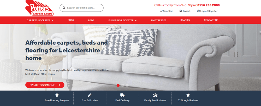
Case Study 5: Potters Carpets & Beds: UX/UI Research, Site Structure, and Technical Integration
Potters Carpets & Beds is a family-run business with over 160 years of heritage. This project demonstrates how a comprehensive technical redevelopment can modernise a traditional brand and turn a static website into a high-performance sales engine.
The Challenges
Outdated User Experience: The previous site was difficult to navigate, making it hard for customers to find specific products among an extensive range of carpets, beds, and flooring.
Poor Search Visibility: A lack of logical site architecture meant search engines couldn’t effectively “crawl” or rank the website, resulting in low organic traffic.
Operational Inefficiency: Managing stock and customer enquiries manually was becoming a bottleneck for the business as it attempted to scale online.
High Mobile Bounce Rates: The old site wasn’t fully responsive, leading to a poor experience for the growing number of users shopping on smartphones.
The Solutions
SEO-Friendly Architecture: We rebuilt the site from the ground up with a focus on “crawlability,” ensuring every category and product page was logically organised for search engines. The new architecture led to a 79% increase in organic traffic and more than doubled the number of ranking keywords (from 443 to over 900).
Advanced Functional Integrations: Implemented a Stock Control API to automate inventory management and added WhatsApp/Chatbot support for instant customer service. The professional redesign improved the site’s “Authority Score,” reflecting increased trust from both users and search engines.
Conversion-Focused UX/UI: Conducted in-depth user research to design an interface that includes a powerful search bar and advanced product filters, helping users find what they need faster. : By simplifying the journey from “search” to “checkout” and adding real-time support tools, the site recorded over 14,000 clicks and a significant boost in sales.
Full Mobile Optimisation: Developed a completely responsive framework to ensure a seamless, high-speed experience across all devices. The API and chatbot integrations reduced the manual workload for the Potters team, allowing them to focus on fulfilment and showroom visitors.
The transformation of Potters Carpets & Beds proves that a data-driven approach to website architecture can breathe new life into a heritage brand. By merging technical SEO foundations with modern automation tools, the business successfully transitioned from a local showroom to a high-ranking digital competitor. This project serves as a blueprint for how traditional retailers can scale their operations and increase revenue through intentional, conversion-focused web development.
What These Projects All Taught Us
Looking across these projects together, a clear pattern starts to emerge. Despite being in completely different industries:
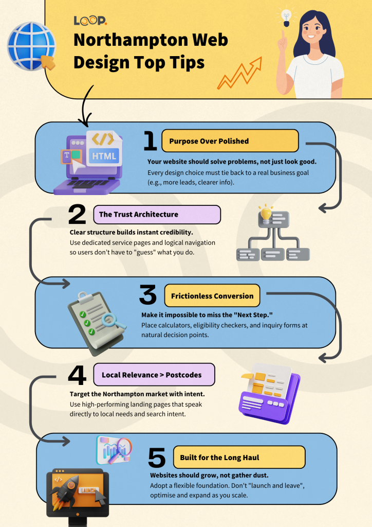
The most successful websites all share the same foundation: they were designed with purpose.
None of these websites was built to simply “look modern” or follow the latest trend. Every design decision was tied back to a real business goal. Whether that meant improving visibility in search, reducing friction in the buying process, or making it easier for users to take the next step, the design always had a job to do. When a website is clear about its purpose, everything else starts to fall into place.
Another consistent lesson is the importance of clear user journeys. The strongest sites don’t leave visitors guessing. They anticipate questions, remove obstacles, and guide users naturally from one step to the next. From enquiry forms placed at the right moment, to calculators that remove uncertainty, to navigation that highlights specialist services, each site is built around how real people actually behave online.
Most importantly, these projects reinforce that good websites support real business outcomes. They build trust, encourage action, and scale alongside the business rather than holding it back. This is especially true for local businesses, where credibility, clarity, and ease of use can make the difference between a missed opportunity and a new customer.
Finally, there’s a clear shift away from short-term trends and towards long-term thinking. These websites aren’t designed to be replaced in a year. They’re built on strong foundations, flexible structures, and thoughtful user experiences that can evolve as the business grows. And that, more than anything, is what turns a website from a digital placeholder into a genuine growth tool.
Supporting Local Businesses to Achieve More
There’s something genuinely special about working with local Northampton businesses. These are companies with real stories, real people behind them, and real ambition to grow, not just for themselves, but for the communities they’re part of. Being able to support that journey through thoughtful website design is something to be proud of.
A recurring theme across all of these projects is the belief that a website should do more than simply exist online. It shouldn’t act as a digital brochure that’s glanced at once and forgotten. Instead, it should work quietly in the background, building trust, answering questions, guiding users, and creating opportunities for meaningful action. When a website is designed with intention, it becomes a genuine tool for growth.
There’s also a real privilege in being trusted with this role. Every business featured here came with its own challenges, goals, and expectations. Helping to translate those into websites that feel clear, confident, and purposeful is not something taken lightly. These projects represent collaboration, understanding, and a shared desire to move forward rather than stand still.
Ultimately, this is what supporting local businesses is about. Not quick wins or flashy results, but long-term partnerships, strong foundations, and digital spaces that help businesses achieve more than they could before. Watching Northampton businesses grow into their online presence and seeing those websites start to work hard for them is exactly what makes this work so rewarding.
Key Takeaways for Northampton Business Owners
Your website should solve problems, not just look good: Every successful site featured here was designed to remove friction, answer questions, and guide users towards action.
Clear structure builds trust: Dedicated service pages, simple navigation, and logical layouts help customers understand what you do and why they should choose you.
Conversion matters at every stage: From enquiry forms to calculators and clear CTAs, small design decisions can make a big difference to results.
Local relevance beats postcode obsession: Targeting Northampton effectively is about intent, clarity, and relevance, not just where your office is based.
Websites should grow with your business: The strongest websites are built as flexible platforms, not “launch and forget” projects.
Ready to Make Your Website Work Harder?
If your website isn’t actively bringing in enquiries, building trust, or supporting your business goals, it might be time to look at what it could be doing better. At Loop Digital, we design websites that are built around real users, real data, and real outcomes, especially for Northampton businesses looking to grow sustainably.
Katie is our exceptional Lead Designer who possesses an innate passion for designing websites and creating captivating themes and aesthetics. Her unparalleled dedication to producing innovative solutions that address client needs and reshape user perceptions is truly commendable. Katie finds immense gratification in crafting tangible designs that leave a lasting impact. Equipped with a comprehensive university degree in Computer Management and Web-Based Studies, Katie brings a wealth of knowledge to the forefront of her role at Loop. Her educational background empowers her to leverage cutting-edge technologies and industry best practices to deliver exceptional design solutions. Katie's expertise shines through her ability to revamp websites, logos, and brands, allowing clients to showcase their business in a fresh and illuminating manner. Her keen eye for detail and creative flair breathe new life into digital assets, providing a platform for clients to shine in their respective industries. In addition to her professional pursuits, Katie's passion for baking serves as a testament to her creative nature and attention to detail. This dedication extends beyond her design work and fuels her ability to approach each project with meticulousness and care. Her ability to understand clients' unique requirements and translate them into captivating designs has garnered her praise and established her as a trusted design partner. Katie's professionalism and unwavering enthusiasm make her an invaluable asset to our team. Her expertise in website design, coupled with her dedication to delivering tangible results, sets her apart as a Lead Designer. Clients can expect nothing short of exceptional designs that elevate their brand, captivate their audience, and drive success.
Looking for your next opportunity?
Digital marketing careers
We’re always on the lookout for talented individuals to join our ever growing team. If you think you’d be a great match for Loop Digital, we’d love to hear from you.